Say you are building a model to read the heart rate measured from a smartwatch. You download the sensor data, run it through your code, and get a number. You might have skipped an important question: was the signal usable in the first place?
Physiological signals like PPG (the optical pulse signal in your watch), ECG (heart electrical activity), EMG (muscle activity), and EEG (brain activity) can be noisy. During the measurement, an electrode could have lost contact, a cable could have picked up interference, or the sensor may have not been attached firmly. This means you could be feeding your model with noisy/unreliable data. But the model does not know that, resulting in a confident, wrong answer.
So before any of the interesting work, there is a boring but important step: signal quality assessment. It answers one question: is this recording clean enough to trust? Not "how do I clean it up" (that is a different job that could come after the assessment).
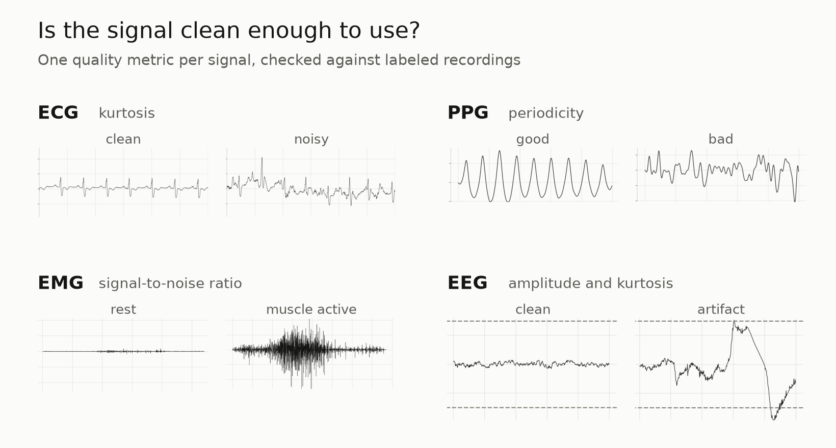
This post walks through a simple quality check for four signals. One metric each, tested on real data. The whole point is that a quick quality check can catch bad signals before they reach your model.
One thing to be clear about: signal cleaning or filtering is not discussed here. Cleaning/filtering is a separate decision you make after knowing that the signal needs post-processing.
ECG: tall spikes mean a clean signal
Let's start with the one where the trick works best.
A clean ECG is mostly a flat line with occasional tall, narrow spikes (the heartbeats). Statistically, that "mostly flat with rare big spikes" shape has a name: high kurtosis. Kurtosis measures how much of a signal's action lives in rare, extreme values. Tall spikes on a flat baseline score high. When noise fills in the flat parts, the signal starts to look like random noise, and kurtosis drops.
So the rule is simple: high kurtosis, probably clean. Low kurtosis, probably noisy.
To test this I used the MIT-BIH Noise Stress Test Database, where clean ECG recordings were taken, and noise was added on known intervals. The first 5 minutes are clean, then they alternate: 2 minutes noisy, 2 minutes clean, 2 minutes noisy, and so on. Because we know exactly when the noise is on, we have a built-in answer key.
Here's a clean stretch next to a noisy one:
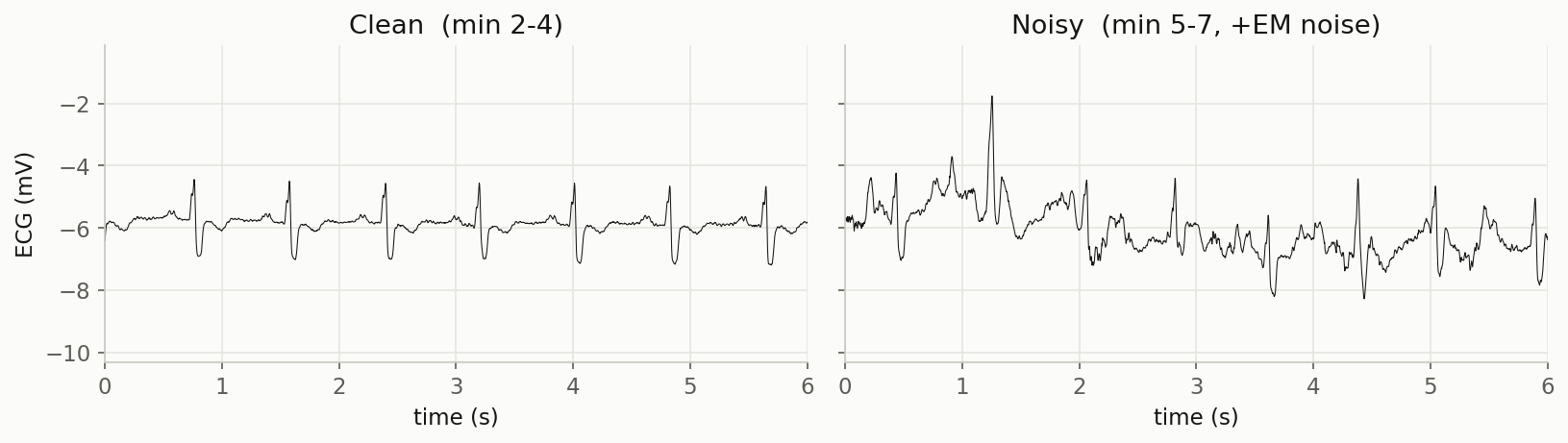
The clean segment scores a kurtosis of 4.35; the noisy one drops to 0.77. Now if I slide that same measurement across the whole 30-minute recording, does it line up with the noise schedule?
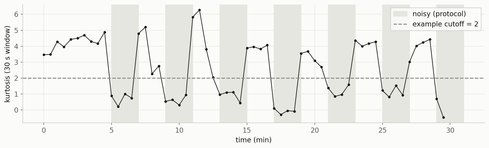
It tracks the noise almost perfectly. Kurtosis is measured around 4-5 on the clean stretches and falls below 1 inside the noisy blocks. If you drew a cutoff line at 2, you would catch nearly every bad segment.
That cutoff of 2 only works for this recording though. A different heart rhythm, a faster heart rate, or a different type of noise would shift the numbers, and the cutoff line would need to move. This means these are useful screens, but not universal constants. It must be calibrated on a different data.
(A technical note for anyone comparing to papers: I'm using SciPy's kurtosis, which reports excess kurtosis, where a flat Gaussian signal scores 0. Some signal-quality papers use the other convention where it scores 3. Same idea, offset by 3.)
PPG: a clean pulse repeats itself
PPG is the signal your smartwatch or phone camera uses to read your pulse. A clean PPG is a steady train of pulses, one per heartbeat, spaced at a regular interval. A messy one, full of motion and drift, loses that regular beat. So the quality question is simple: does the signal repeat?
The way to measure "does it repeat" is autocorrelation: slide a copy of the signal against itself and check how strongly it lines up at a delay of one heartbeat. A clean pulse train lines up again at that beat interval, giving a strong peak; noise does not. I take the height of that peak as the quality score, and call it the periodicity.
You might expect skewness here instead. It is the textbook PPG quality metric: a 2016 paper by Elgendi compared eight indices and found skewness the best single one, because a clean pulse has a lopsided, sharp-peaked shape. But that result came from a 367 Hz fingertip sensor. A smartphone camera records PPG at 30 Hz, and at that rate the fine pulse shape is gone. I tested skewness on this data, and it did no better than chance. The lesson: match the metric to the sensor, not just to the signal type. What survives at 30 Hz is the rhythm, so that is what I score.
I tested it on the BUT PPG database: almost 4,000 smartphone PPG recordings, each labeled by an expert as good or bad. A recording was labeled good only when experts could read a heart rate off it, so the label really asks whether a clear beat is present. That is exactly what periodicity measures, and it gives me an answer key to check against.
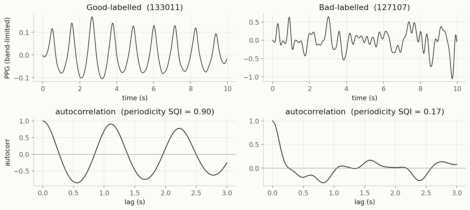
The clean recording repeats about once a second, and its autocorrelation rings up and down as the sliding copy falls in and out of step with the beat. The noisy recording has no such structure, so its autocorrelation just decays. Periodicity scores them 0.90 and 0.17.
Now, does periodicity agree with the expert labels across many recordings?
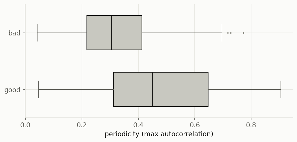
Good recordings do score higher (median 0.45 versus 0.30 for bad ones). But the two groups overlap, and no single cutoff cleanly splits them. Ten-second smartphone readings are genuinely difficult. Periodicity here is a useful screen, one input among several, but not a magic classifier. Of the four signals in this post, this is honestly the least clear-cut result.
EMG: is the muscle actually firing?
EMG measures electrical activity from muscles. There is no one agreed-upon quality metric for EMG the way there is for PPG and ECG. So instead I will show the one commonly-used in practice: signal-to-noise ratio (SNR).
The idea is straightforward. When a muscle is active, you should see a big signal. When it is at rest, you should see almost nothing. SNR just compares the two: how much greater is the "active" signal than the "resting" baseline? A healthy, responsive electrode should measure a clear gap.
I used Ninapro DB2, a forearm EMG recorded while someone performs hand gestures. The dataset labels which moments are rest and which are a gesture.
One important caveat is that those labels tell you where muscle activity is expected, not whether the signal is good. So this check is rather self-referential: it confirms the signal rises above its own baseline when a gesture happens. It is a responsiveness check, not a true quality verdict. (A gesture disrupted by motion could still post a high SNR.) Still, it is a useful sanity check.
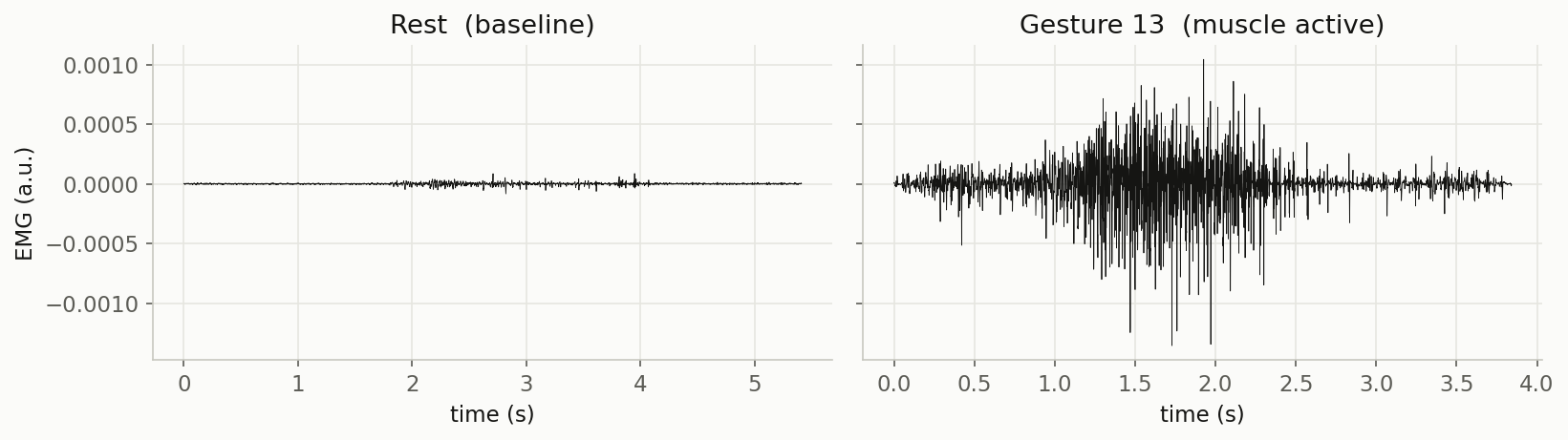
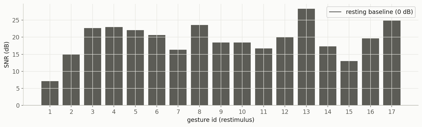
Every gesture scores well above the resting baseline (comparing rest against itself gives you 0, as it should). So the electrode is responsive and the signal shows up where it is supposed to. Just remember that "good SNR" depends on the muscle and the movement: a subtle finger twitch legitimately produces a smaller signal than a full grip, so read it per channel and per task, not against one global number.
EEG: two metrics, because one has a blind spot
EEG measures tiny electrical signals from the brain. Real brain activity lives in a band of a few tens of microvolts. So the first quality check is quite simple: if a segment swings anywhere near ±150 µV, that is almost certainly not the brain but an artifact. It could be an eye blink, a jaw clench, a bumped electrode, etc.
As an initial check, this is fine, but it has a blind spot. A brief, sharp spike (e.g. an electrode pop) can register while never getting anywhere near ±150 µV. Thus a simple amplitude check lets it pass through.
This amplitude check can be paired with kurtosis, the same "rare extreme spikes" measured from the ECG section. Spikes give it away as heavy tails even when they are small. The interesting result is that the two metrics catch different problems.
In this experiment, I used a night of sleep EEG from the Sleep-EDF database.
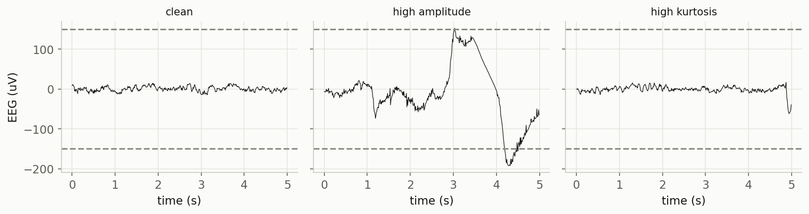
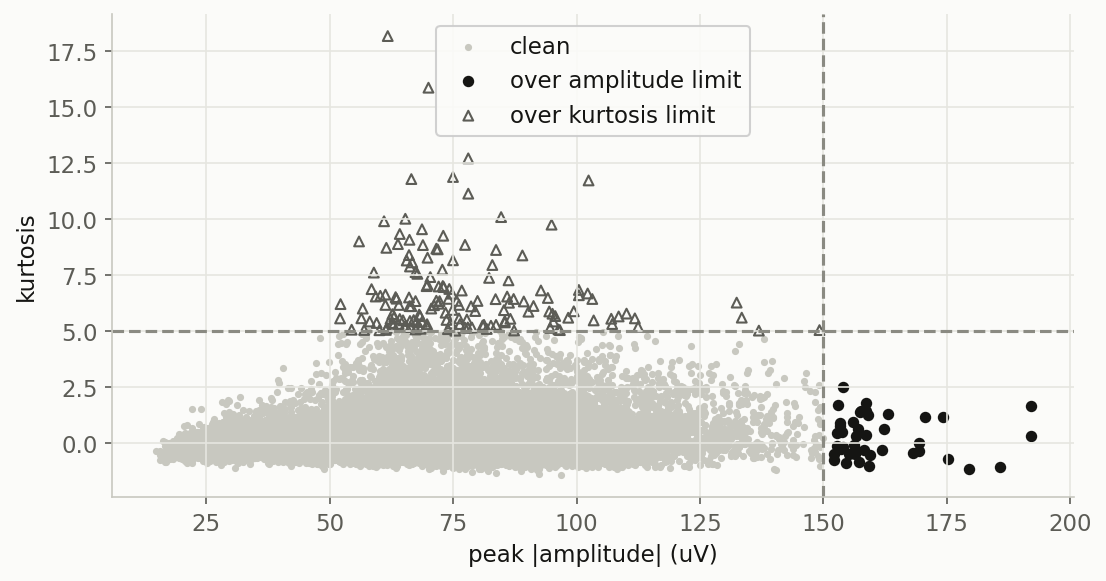
The two checks barely overlap. Amplitude check catches the big slow artifacts, while kurtosis catches the brief spikes that slip through the amplitude line.
Same caveat as everywhere else is that ±150 µV is not an absolute threshold value. Children's EEG, deep sleep, and different electrode setups all shift the safe range. Tune both numbers for your own recordings.
The one habit worth taking away
Four signals, four simple metrics:
- ECG → kurtosis (tall spikes = clean)
- PPG → periodicity (a clean pulse repeats)
- EMG → SNR (active louder than rest = responsive)
- EEG → amplitude limit + kurtosis (two checks, two blind spots covered)
Each metric can be computed in a few lines of Python, and each one behaved as expected when I tested it on real data with a known answer key.
The habit underneath all of them is the same: check before you trust. It is a good practice before handing a signal to your model. Quality assessment tells you whether to trust a raw signal. What you do about the bad parts (drop them, flag them, or clean them) is a separate decision, and a topic for another post.
I put the full code (loading each dataset, computing each metric, and generating every figure above) in a notebook on GitHub if you want to run it yourself or adapt it to your own signals.